Colour Me Beautiful!
Colour is having a surprise resurgence – and this growing trend means much more than just fabulous interiors for us all to be inspired by!
Colour isn’t just a way to express ourselves, it’s long known to have significant affect on our emotions – red adds energy, green brings calm, yellow encourages optimism – we are pretty familiar with that concept. But the less discussed power of colour is its ability to immediately reflect how our social environment is taking a deep hold of our personal outlook and sense of our own future. Just as colour can affect how we feel, the colours we choose can also reveal our inner thoughts – often without us even knowing we are doing it.
Traditionally in times of uncertainty, companies have seen an almost immediate impact on the colour-driven buying behaviour of consumers on their product lines. Prior to the events of September 11, 2001, the US was enjoying heady times, with rapid rates of growth in the preceding years. Consumer confidence comes out in colour, and interior trends were celebrating vibrancy and adventure with an abundance of bold hues. However, almost immediately following September 11, there was an instant shift back to more conservative colours, walls went back to beige, sofas to brown. Or in other words, when the world got scary, our choices became safer, and our homes subsequently more subdued.
But there has been a surprising shift in the past few years. While the world has been clouded by instability, we have not seen the same shift in colour trends. The fact that colour company Pantone named the violet-red shade ‘Very Peri’ as the 2022 colour of the year, is a case in point. That a world population exhausted by the effect of a long pandemic would embrace such a vivid, energetic shade flies in the face of the past trends of retreating to beige. And thank goodness; the idea of vibrant colour still trending in our homes and lives is music to my ears.
In the past, colour has been treated almost like fads, green is in, red is out – but the truth is that colour shades are never really fads. Colour is a highly personal preference, and using your favoured colours in your home is the shortcut to making a house feel like your home. It’s the most simple way to stamp yourself on a space, making it uniquely yours.
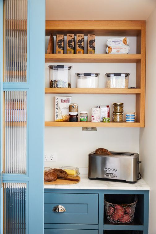
making it feel like my own space. Photography by Cath Muscat/The Interiors Edit
The Secret Trend that solves all colour problems!
The one trend that rules all is the undertones of colours. This is the secret to understanding how to choose and mix colours in your home. You can go down a serious rabbit hole trying to understand how to identify the undertone of a colour, but for me there are two simple tones that actually matter: grey and beige.
In all the years I have worked in interiors, I have come to understand it’s the gentle flow between one to the other that dictates our palettes, and is the secret to creating a room that ‘just feels right’. It seems to work on around a 15-year cycle – which is a relief to all of us who are investing in renovating and decorating! At the cool end of the trend cycle, is the greys – cooler whites, clearer colours and generally more contrast, at the other end of the trend line is the beige cycle, warmer whites, muddier colour tones and colour schemes that graduate rather than contrast. Helpfully, in the middle of this 15 year or cycle, we have what I like to call the ‘greige period’. As we slowly transition between them, we see the two undertones come together to form a warm grey undertone.
Right now, we are firmly in the beige era, with warm mustards, rust reds, ochres and deep-aged leathers leading the way – the palette is warm, soothing and comforting – but definitely not boring! The tones are rich and saturated, and as long as all the pieces you choose to add to the room all have the warmth of the beige undertone, you can pretty much choose any colour and it will sit pretty comfortably in the mix. You’ll find that most pieces in the stores right now will have this undertone – because these are true trends that matter, and it does make life a bit easier. However, if you have some old pieces – from say 10-15 years ago, when we were in the grey period, bringing them into the same space just doesn’t feel quite right – and unless you’re aware of this, it’s hard to put your finger on exactly why that particularly piece doesn’t work.
To the untrained eye, it can be hard to look at a colour and know instantly what the undertone is. The best way to work it out is by comparison – find another piece in the same colour group and put them side by side, as soon as you see them together, you will instantly see if one is ‘muddier’ or warmer than the other – if you’re struggling to find a comparison colour, use a simple colour wheel from a paint company to give you a guide.
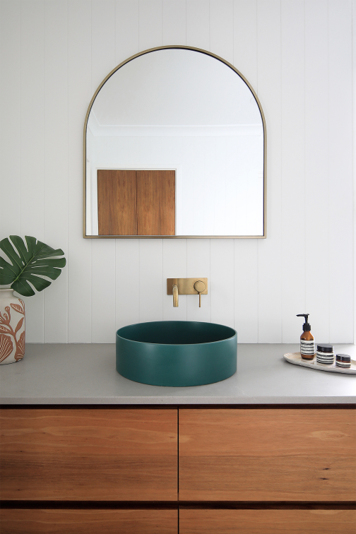
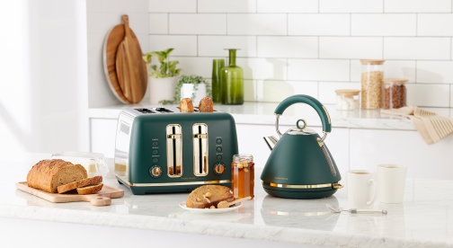
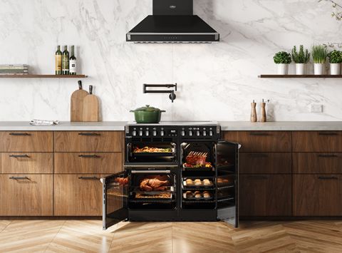
The difference I’m seeing in the use of colour coming through, is that we are finding new ways to use colour to make a statement about ourselves, rather than just adding a safe splash to add interest to a room. It’s not just about accessories, art and soft furnishing any more. We are getting bolder, with bright flashes of colour in more functional pieces and places, such as the interior of our cabinetry as well as the exterior, the basin in our bathrooms setting the colour direction rather than just towels – and in the ultimate of statements, finally moving away from stainless-steel appliances and investing in a fabulous cooker for your kitchen in a stunning colour – a style move that creates a truly unique kitchen. I’m slightly obsessed with the Kingfisher Teal range cooker from the Belling Colour Boutique range!
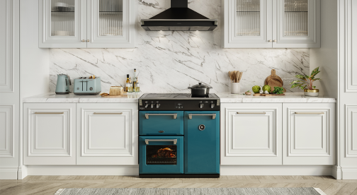
I have always been a great believer in the idea that every colour is on trend, and it’s the shade and the undertone of the colour that makes it work at any given time. For me, it’s always been about greens and blues, sage greens to petrol blues and deep, inky navy shades. I’ve always been a bit partial to yellows too, and I embraced the return of mustard tones to interiors with gusto. I’m loving the more confident deep, rich yellows that are evolving out of the early mustards and I am starting to dream about a yellow kitchen in my future – every colour has its moment in the sun right!

Welcome Wendy Moore!
We are delighted to announce that Wendy Moore – One of Australia’s most influential television stylists and home experts as well as Selling Houses Australia co-host is joining the Belling team as an ambassador.
